Color is one of the most essential elements of design, shaping how we perceive and interact with it. A well-chosen color palette can make your design more appealing and visually pleasing, while also evoking emotions such as happiness or calmness. The right palette can instantly set the mood, convey feelings, grab attention, and communicate a message—all without using a single word. Whether you’re designing a poster, website, brochure, template, logo, or social media graphic, your choice of colors plays a major role in how people interact with and interpret your work.
With millions of colors, shades, tones, and combinations available, the challenge is: which ones should we choose? Beginners often struggle with this decision. The good news is that once you understand the basic principles of color theory and psychology, selecting the right colors becomes much easier.
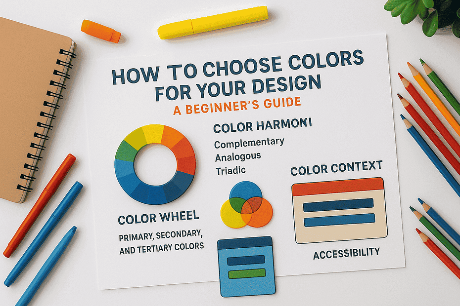
In this post, we’ll explore the basics of color selection—from the color wheel to practical tips—so you can confidently create designs that work.
Why Color Choice Matters in Design
When someone sees a design or anything else, the first thing that comes to mind is the color. It creates the first impression before they even read the text or notice the finer details.
Emotions: Color affects how people feel and react. For instance, red conveys energy, boldness, and urgency, while blue feels calm and trustworthy.
Brand Identity: A signature color can boost brand recognition and awareness by up to 80%. For example, Coca-Cola’s red, Facebook’s blue, or Spotify’s green. These colors aren’t chosen randomly—they’re carefully selected to reflect each brand’s personality.
Usability: The contrast between text and background colors is crucial for readability and accessibility. High-contrast combinations (such as black on white) make designs easier to read and understand.
Basic Color Theory
Before we talk about palettes and harmonies, it’s important to understand the basics of how colors work.
Primary, Secondary, and Tertiary Colors
- Primary Colors: Red, blue, and yellow. Most people know these cannot be created by mixing other colors.
- Secondary Colors: Green, orange, and purple. These are created by mixing two primary colors.
- Tertiary Colors: Created by mixing a primary color with a secondary color, such as blue-green or red-orange.
Warm, Cool, and Neutral Colors
- Warm Colors: Red, orange, and yellow. They create feelings of energy, passion, excitement, and urgency. Warm colors grab attention and can stimulate appetite, which is why they are often used in marketing for fast food and sales.
- Cool Colors: Blue, green, and purple. These feel calm, professional, and refreshing. Brands in healthcare, finance, and technology often use them to convey trust, professionalism, and security.
- Neutral Colors: Black, white, gray, beige, and similar tones. Neutrals provide a sense of simplicity, sophistication, and balance. They are essential for creating visual hierarchy and allowing other colors to stand out.
The Color Wheel and Harmony
The color wheel is a helpful tool for designers. It displays colors arranged in a circle, helping artists, designers, and marketers create combinations that appear balanced and natural.
Here are some common color schemes:
- Complementary: Colors that are directly opposite each other on the wheel, such as red and green or blue and orange. This combination creates a strong contrast and grabs attention.
- Analogous: Colors that sit next to each other on the wheel, such as blue, blue-green, and green. These feel harmonious and are great for calm, soothing designs.
- Triadic: Three colors that are evenly spaced around the wheel, forming a triangle, such as red, yellow, and blue. This creates variety while maintaining a sense of balance.
If you’re unsure which colors to choose, start with one base color and use the wheel to find matching combinations.
Color meanings can vary across cultures and contexts, but keeping these associations in mind will help you choose colors that align with your design’s purpose.
Psychology of Colors
The psychology of color is the study of how different colors affect human emotions, moods, and behaviors. It is a powerful tool used in marketing, branding, interior design, and art to evoke specific feelings and influence decisions.
Here are some common associations:
- Red → Energy, urgency, passion, love, and power. It is often used to stimulate appetite and is a popular choice for “call to action” buttons and sales signs.
- Blue → Trust, calmness, professionalism, stability, security, serenity, and intelligence. It is often used in financial services and technology to convey trust and security.
- Green → Nature, growth, health, peace, and money. It has a calming effect and is often used by brands focused on sustainability or wellness.
- Yellow → Happiness, optimism, warmth, and clarity. It is highly visible and often used for caution signs to grab attention.
- Orange → Friendliness, fun, confidence, enthusiasm, and creativity. It is a vibrant color that signals playfulness or adventurous energy.
- Purple → Luxury, imagination, wisdom, royalty, and spirituality. It is commonly used for high-end products and services.
- Black → Elegance, power, sophistication, and formality. Luxury brands often use it to convey authority and timelessness.
- White → Simplicity, cleanliness, purity, and clarity. It creates a sense of space and can make a design feel modern and minimalistic.
Color meanings can change depending on culture and context, but keeping these associations in mind helps you choose colors that fit your design’s purpose.
Practical Tips for Beginners
Mastering color is one of the most powerful skills for a designer. But as a beginner, how do you actually apply it to your designs?
Here are some simple, practical tips:
Start with 2–3 colors max
As a beginner, don’t overwhelm yourself with too many colors. Begin with just two or three. This forces you to be more thoughtful about how you use them and helps create a clean, intentional design. As you gain confidence, you can slowly expand your palette.
Use contrast for readability
Make sure your text is easy to read and stands out against the background. For example, dark text on a light background (or the reverse) is usually easier to read.
Test your design in dark and light mode
Check your design in both dark mode and light mode to ensure your colors remain readable and attractive. Make sure there’s enough contrast in both versions.
Stay consistent
Use the same set of colors across your design or brand to maintain a unified and professional look.
Don’t be afraid of white space
Sometimes, simplicity is best. You don’t need to fill every corner with color—neutral space helps your main colors stand out.
Tools That Can Help
If picking colors feels difficult or overwhelming, don’t worry—many free tools can guide you and make the process easier.
- Color Extractor Tool – Upload an image and get a matching palette.
- Adobe Color – Explore color harmonies and build custom palettes.
- Coolors.co – Quickly generate and save palettes.
- Canva Color Palette Generator – Create color palettes from any photo.
These tools not only save time but also help you experiment with new combinations you might not have thought of on your own.
At first, choosing colors may seem tricky or difficult, but with a little practice, it becomes easier and more natural. Start with the basics of color theory, and use the color wheel to guide your combinations.
Pingback: Design Inspiration Is Everywhere—If You Know Where – Rupixl